Velloca Brand Identity
The Visual Blueprint of Discipline
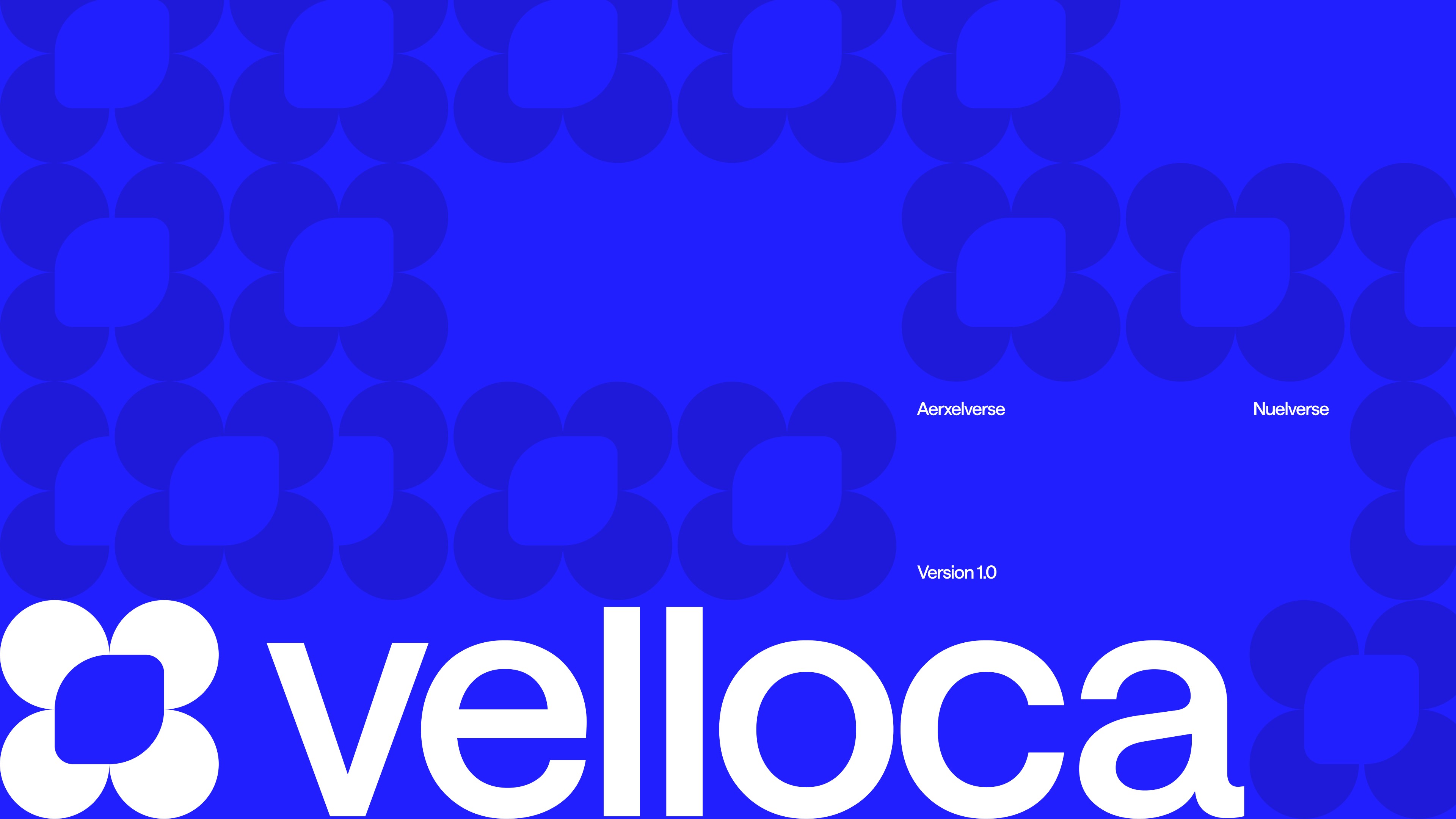
Velloca: Branding & Visual Identity for the World’s First Discipline Engine
Finance apps are either too "fun" (gamified and distracting) or too "corporate" (grey and intimidating). Velloca needed to be a "Discipline Engine"—a system that feels like a premium tool but acts like a firm guardrail.
—————
The Challenge
Traditional budgeting is a post-mortem of financial failure. It tells you what you did wrong last month. The challenge was to build a visual system that felt as strict as an enterprise governance tool but as friendly as a consumer app. We called this Strict Simplicity.

The Core Concept
The identity is built around Velloca Kinetic Blue. It is a high-frequency, high-contrast color that represents movement, technology, and the "Modern Operator." It’s designed to stand out in a sea of "safe" bank blues.


The Design System


The Enforcement Layer
We designed for the "No." Most apps try to be polite; Velloca is an accountability partner. The UI uses high-contrast visual cues to show exactly where your money is assigned. No jargon. No fluff.

Visual Elements